Showing posts with label inkscape. Show all posts

Tuesday, 16 August 2016

summer school

This month I’m taking part in a four week summer school all about pattern design. I’m really enjoying it so far, and getting into the second brief. Before that’s done though, I wanted to share a bit here about the first brief and my design for that, as well as what I’m learning.

What I most appreciate about the summer school is the community. There is a very active facebook group for all the participants where we share our work in progress, get feedback as well as share other helpful tips. Its also very helpful to have a comprehensive design brief to work with, as well as a deadline that pushes me to complete a design.


The first brief had the theme modern pop art and I immediately felt out of my depth, since this is a style I haven’t tried before! I wanted to create something with a clear pop art look, while still letting my own style shine through. The subject matter was left open, so I decided to do a kitchen. I started with sketches of different kitchen utensils, then spent time tracing them with a fineliner, before erasing all pencil marks, scanning and importing them into inkscape where I traced them and created individual icons. To pull the design together I decided to make kitchen cabinets and add hexagon tiles in the background. 


One of the creative exercises in class was to create a colouring book page. This was the perfect excuse to print off a few copies of the design in black and white and spend some time with coloured pencils thinking about the colour scheme and colour placement. I don't often print out designs at this stage, just because I don't have a printer and it means a trip to the library, but I really like to do it, since I often see something I wouldn't have thought of otherwise. 


At this stage my design looked like this and I asked for some feedback from the other course members:


I got some good feedback and kept working, adding colours and details. I'm glad I did this, even though I was happy with the first draft. I feel like doing this design for a deadline pushed me to make it even better. I needed it to say "pop art" more. Dots always help for that :-) I also added an oven, more colours on the kitchen cabinets, as well as more things happening, a dripping tap, steam coming out of the oven, a pile of flour and music coming from the radio. I feel like the final design tells more of a story. Now it just needs a pop art title, something like: Honey, did you remember to turn off the tap when you took the bread out of the oven? :-)


ps. all the designs from the first design brief of the course are on show here. 

Friday, 3 July 2015

fabric shots - armadillo bison cardinal

This is what my set-up looks like to try to get good shots of fabric swatches. A white background, a sunny day but no direct sunlight, some white fabric rolled up to "fill" the swatches, and a bit of time to try out different things.


 These are 8x8 inch fabric swatches printed on combed cotton from my collection "Armadillo - Bison - Cardinal" which I wrote about a few months ago. The samples printed with beautiful bright colours, and are now all available for sale in my shop.


Sunday, 28 June 2015

watercolour power tools

I've often mentioned spoonflower contests I enter. Recently I made it into the top ten for the first time which was incredibly exciting. The top ten designs are immediately set for sale and are part of a fat quarter bundle promoted on spoonflower for a week, which means more people see (and hopefully buy!) the design. Spoonflower also takes beautiful pictures of the fabric which are bigger than the fabric swatches I usually get. Here's the photo they took and this is where you can buy the fabric. I love how the colours turned out!


Watercolour power tools is a kind of strange combination, but I got inspiration to make this design from two people. My uncle is a fine woodworker and has an amazing shop where I love to hang out whenever I'm in Manitoba. I recently asked him for some photos of tools to use for a series of designs (here are some others I've made for the series: power saw and woodworking tools).
When I was in the Netherlands at Easter I visited my grandmother who has always encouraged me to try all kinds of things like painting, sewing, knitting and even leather work. I told her a bit about designs I've been working on recently and she gave me a beautiful block of watercolour paper. This was the first painting I worked on. I love the look of the watercolour paint on the fabric, and hope to do some more watercolour designs soon.

Wednesday, 4 March 2015

fabric photos

One of the most popular fabrics in my shop is the design vegetable garden. I've written about the design before, which I designed as a tribute to my grandma and her garden. There are a number of different designs in the collection. Here is a photo of fabric swatches printed on cotton poplin for three of those designs (vegetable garden, gardening fruit and canning).


Monday, 12 January 2015

tea towel calendar

I posted earlier about my tea towel calendar design for 2015. Since I gave a few tea towels as christmas gifts, I didn't want to post photos in December. Here is a picture of the finished tea towel. I ordered the linen cotton canvas and hemmed the edges. The fabric is now available for sale in my shop.


Friday, 9 January 2015

inkscape tutorial - create a union of different objects

When I work in inkscape it's often helpful to create a union of different objects. This is similar to grouping them, but rather than creating a group of different objects, a union functions as one object. This is useful if you have many small objects in a design like the dots on my rosehips below.
Inkscape seems to be a bit buggy when it comes to very large files with many groups of objects. Reducing the number of groups helps when working with large designs.


Step 1: Decide which objects you want to create a union with. All the little dots on the rosehips are single objects. I want to be able to manipulate the colours more quickly, and want lines of dots to function as single objects so that I can more easily change colours and move the dots around.
Step 2: Select all the objects.
Step 3: Under path click on union. Or use the keyboard shortcut CMD +
Step 4: The row of dots now functions as one object. Change the colour, or move the object to a different position.

ps. do you like the pattern? Its one I've been working on the last few weeks. I'll share more when its done.

Monday, 17 November 2014

more autumn berries

Some more finds from my walks around the neighbourhood.


I had fun arranging this on a piece of paper and then turned them into a fabric design: sketching, digitizing, arranging and coloring. Just love the process.


Saturday, 8 November 2014

fabric swatches

A few days ago I got a package with fabric swatches (always so exciting :-)). Here is my new collection in two different colourways:


I've now set them for sale in my shop. I'd love to try this one as wallpaper. What do you think?


Thursday, 9 October 2014

tutorial - shifting an object in inkscape

I've been using inkscape for years and what I love about it is that I keep discovering new things it can do. I suppose that could be something that bugs me, since the user interface can be quite overwhelming to figure out, especially when you're starting out, but I like the feeling that there are all kinds of possibilities I don't know about. Yesterday I found the move function under transform (Object - transform, or Shift+Ctrl+M). What this does is move an object a certain number of pixels either vertically or horizontally.


In fabric design this is something I do all the time in order to create a repeating pattern. Until now I've been using a more convoluted method: placing an object at 0 on the x or y axis, duplicating, then moving the second object along the x or y axis depending on the width and height of the page, grouping the two and placing them where I want on the page (it sounds more complicated than it is, but its a lot of extra steps compared to using the move function).

You can see how easy it is to move the whole group of girls in the design below to quickly see how the pattern looks in repeat. Group them all, duplicate and move horizontally the number of pixels of my page width. 


The design I've been working on this week is once again for the spoonflower design contest. This week's theme is umbrellas, and I reworked some of the girls from this design, added a few more and played with colour and placement. 

You can see the final design in my shop (not yet for sale) and see the other designs in the contest here (voting starts this evening). 

Now I'm looking forward to trying out the different options of the transform tool and hopefully discovering other functions I didn't know about. 


Sunday, 28 September 2014

creating a fabric collection

A few weeks ago I took an online course on pattern design at creativelive. Even though the course focussed on using adobe illustrator to create fabric designs and I use inkscape, I found it very helpful and learned a lot. Part of the course was learning how to create a collection and there was a design competition hosted by the teacher, Bonnie Christine, to create a fabric collection and document the process. It took me about two weeks to create the collection and I enjoyed really thinking through how different designs work together, coming up with a colour palette, and playing with different ideas for designs. I documented the whole process here, but here are a few details:


And here is the final collection:


I also enjoyed coming up with a title for the collection and names for each design. Usually its a bit of a challenge to come up with a good name for a design. Thinking of the designs as part of a collection helped!

Following through until a collection really feels done is a lot more work than I often put into designs, but its definitely worth it and makes me want to revisit some of my earlier designs and collections to give them a final polish. The designs will soon be available for sale as fabric, wallpaper and paper in my shop.


One of the things I'm inspired to do with further designs is to spend more time on the brainstorming and sketching stage. It really helped to spend a few days letting ideas grow, trying out different options and colours and giving them time to settle and mature.

Monday, 1 September 2014

inkscape tutorial - simplify paths

Here's a very small tutorial showing something I use quite a bit when designing with inkscape. When I scan a drawing and then use the trace function in inkscape to convert the lines to vectors, the lines are often quite bumpy. Sometimes that's fine, but often I want smoother lines, and more importantly, I want less nodes on the path so that its easier to clean up and edit.


Step one: select the object, making sure you have the "edit path by nodes" button activated, so that you can see all the nodes.

Step two: path - simplify, or Ctrl + L

Step three: this reduces the number of nodes while keeping the shape of the object basically the same.

Step four: zoom in and tweak the remaining nodes until the object is the shape you want.

Two things I've noticed while doing this: 

If you select a number of objects and try to simplify them at the same time it doesn't work nearly as well. The paths end up looking like an abstract mess. However, if you just select one object at a time, the shape stays basically the same. You do have to be careful though, since sometimes this will delete so many nodes that your object changes shape drastically. 

When I scan a drawing to convert it to vectors in inkscape, it helps a lot if I first slightly blur the picture before performing the trace in inkscape. This smooths the lines before the actual trace, meaning there is less clean up / simplification of paths needed and also results in smaller, easier to handle files.

ps. the examples are from a new design I'm working on (yes, thats me reading a book in my living room)


Friday, 8 August 2014

beetles and blackberries

Last weekend we went on an outing to Beddington Park and saw lots of ripe blackberries. I didn't have a container along to pick any, but took a photo instead and inspiration for a new design.


I know the japanese beetles in the design are a bit strange, but I decided to add them so that I can enter this design in next weeks spoonflower contest (topic: beetles) and will make a version without beetles.


Saturday, 28 June 2014

faux suede

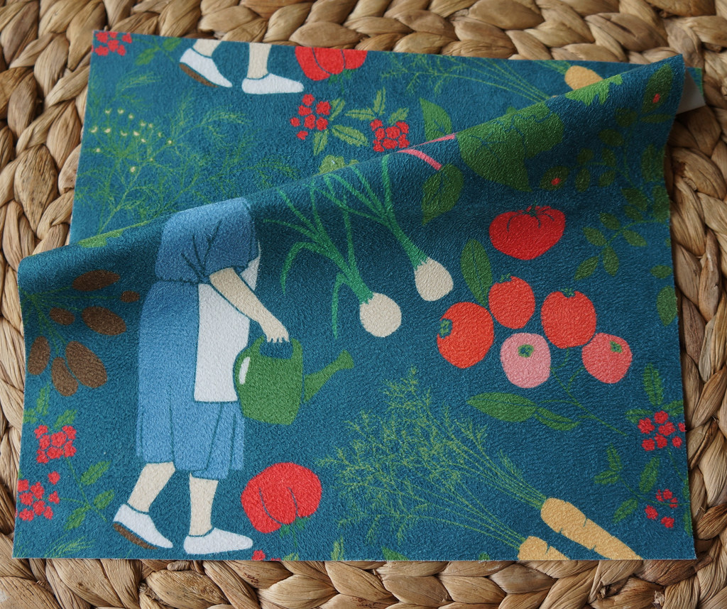
The latest fabric added to the line of fabrics my designs are available on is faux suede. I ordered a swatch and really like the quality of the fabric. Its thick and would be suitable for upholstery or for sewing bags or pillows. The colours printed very well and also very densely, there is no white showing through anywhere. Its quite stiff and apparently gets softer with washing. 
The design I had printed is available for sale here
And in case you're wondering why I folded it so the head isn't showing, I reworked the original design since ordering the fabric, because the head looked very strange!

Sunday, 22 June 2014

garden

My grandma had a huge garden and whenever I visited her I loved to roam through it, randomly picking raspberries and rhubarb stalks, smelling the lilacs and trying the crabapples. These designs feature plants from my grandma's garden and drawing each plant evoked memories and smells and tastes.


I entered one of them in this week's spoonflower contest. Its so much fun when a design starts to come together.

Wednesday, 21 May 2014

terrariums

Terrarium is a nice word isn't it.

I had a baby 7 weeks ago, life has changed a lot!

Last week I sat for an hour in a café sketching the little glass jars holding sugar cubes. At home I reworked the sketches...


... and created little terrariums filled with fabric flowers. The finished fabric design:


ps. its a bit sad what saving as a .jpg does to the image quality..

Friday, 3 January 2014

create your own pattern fill using inkscape and gimp

This week on spoonflower there is a contest to create a cheater quilt. A cheater quilt looks like a pieced quilt but consists of only one piece of fabric, meaning you can skip the piecing and create a cheater quilt by just quilting.

After I designed the quilt block, I needed to fill the pattern with different fabric designs - making it look like a pieced quilt. The contest came with a colour palette and a theme (spring floral). I have quite a few fabric designs featuring flowers and wanted to use some of them to create the quilt. However, I had a hard time figuring out how to fill the pattern with those fabric designs in a way that looked like a pieced quilt.

I finally figured out that it's possible to use your own pattern with the bucket fill tool in Gimp. This tutorial shows how its done.


Step 1: Open your file, this should be a repeating pattern already. Steps 1-3 here are done in Inkscape, but could also be done in Gimp. 
Step 2: Since I needed to use a preset palette I selected all the objects of one colour, grouped them together and then played around with different colour combinations. Grouping the objects of one colour makes it easier to create a number of different colour combinations.
Step 3: Save your file as .png and open again in Gimp (again, these three steps could be done in Gimp, but I prefer working with .svg files, especially when changing colours.)
Step 4: I usually made the file a bit smaller, so that the bucket fill looked better on the finished design. Export the file as a gimp pattern file (.pat), then move that file to the pattern folder. On a mac using Gimp 2.8 the pattern folder is located here: Library - Application Support - Gimp - Gimp 2.8 - patterns. Then just restart Gimp and the pattern will show up in your toolbox.
Step 5: Select bucket fill - pattern fill and choose the pattern from the list.
Step 6: Fill! You should have a seamless repeating pattern. (Extra tip: Sometimes you might want to fill two adjacent areas with the same pattern, but make it look like fabric, where the repeat would not continue across the two objects. For that I created two patterns which are mirror images of each other.)

Here is the completed cheater quilt, with paper pieced and appliquéd tulips.


You can see the fabric here and the coordinating fabrics here

update: The contest is now open for voting, visit here to see the other designs and vote for your favourite.


Wednesday, 27 November 2013

Neuenheim fabric

The design I was working on of the Neuenheim shoreline is finished and I received the proofs of the fabric in the mail last week. I made two designs, one featuring the shoreline in a tea towel calendar:


and another coordinate fabric with stripes of the shoreline:


Both fabrics are available for sale in my shop


Tuesday, 11 June 2013

baskets of berries

I had a bit of time last night to design, so I worked on an entry for this week's spoonflower contest with the theme farmer's market. I like the theme, it conjures up images of stacks of vegetables and flowers, sunlight and cheese and coffee (thats what the market close by is like). I decided to draw some little baskets of berries. I usually start with a pencil sketch, then draw the outlines with a pen, erase any pencil lines and take a picture. This is how it looks:


Then I trace the image in inkscape to make it into a vector image, and play with colour and placement. I've also recently starting painting bits of the image in gimp, to give it more texture. This is the final design:


update: you can see the other designs and vote here


Monday, 6 May 2013

inkscape tutorial - put text on a path

This week's contest on spoonflower is birthday-themed wrapping paper. For my entry I used a design I made a few weeks ago but added the text happy birthday. I wanted the text to follow the lines of the vines and flower stems. This tutorial shows how to put text onto a path using inkscape.


1. Write your text, choose the font you want to use and size it so it will fit where you want it to go.

2. draw a path using the bezier curves tool, curving it to follow your line. I first drew the line in black,

3. and then made it invisible (unlike the clip function, with this function you still see the line after you put the text on the path, so if you don't want to see it, make it invisible). Then select the path and your text.

4. Text - Put on path

5. and your text curves to follow the path! If the text doesn't quite fit (it starts at the beginning of the path and gets cut off at the end) you can undo, resize and try again.

6. Basically thats all, but I wanted the text to take the place of the existing lines, so I had to remove the vine where the text was. For that I selected two nodes and clicked on "break path at selected nodes".

7. Then I could move those nodes, do the same at the other end, and delete that section of the vine.

8. The text fits perfectly!

Here's the finished design:


Tuesday, 2 April 2013

Jane Austen chairs

Did you notice the new header? I recently painted these chairs and thought they would look nice here. They were done for a contest on spoonflower, the topic is "living in a Jane Austen novel". They made beautiful chairs in those days! And the nice thing about the computer is that its easy to reupholster a chair just by changing the colour of the fabric. I painted four chairs in different colours but decided the whole design looks better in one colour.

postcards from heidelberg

You can see the other designs from the contest and vote for your favourite until tomorrow! 
update: this fabric is now for sale here.