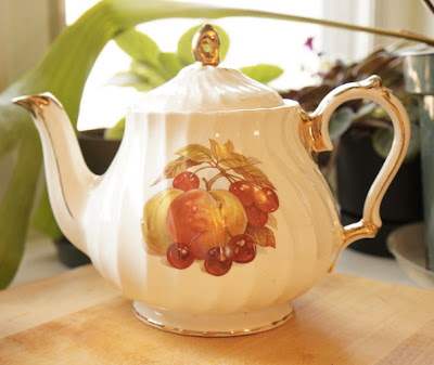
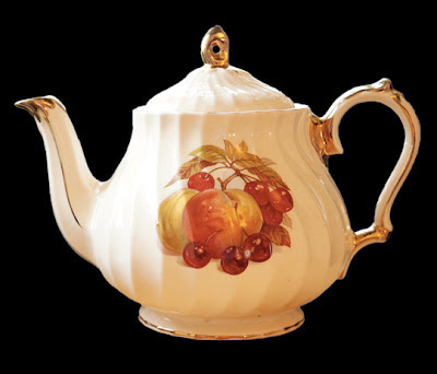
Using gimp and inkscape I've been playing with this design. its far from finished, but here are the steps I've taken so far:
Step 1: Take a picture. This is one of Kerry's teapots. I liked the lighting but I should have taken this in front of a neutral background, which would have made the next step easier.

Step 2: Select the teapot. I zoomed in to 400% and used the free select tool. it takes a while tracing the teapot, but it gives better results than the scissors select tool. I also learned that you get better edges if you select feather edges (I moved the radius up to 22)
Step 1: Take a picture. This is one of Kerry's teapots. I liked the lighting but I should have taken this in front of a neutral background, which would have made the next step easier.

Step 2: Select the teapot. I zoomed in to 400% and used the free select tool. it takes a while tracing the teapot, but it gives better results than the scissors select tool. I also learned that you get better edges if you select feather edges (I moved the radius up to 22)

Step 3: Again in gimp, I desaturated the image (Colours - Desaturate) and then changed the threshold until I was getting a clear image. I inverted the colours and used the colour select tool to select the teapot and Ctrl-comma to change the colour.

Step 4: The teapot in gimp doesn't have very smooth edges, so I opened the image in inkscape for this next step: Click on the image and then choose Path - trace bitmap. Then I could zoom in and use the edit path by nodes to smooth out the edges.


4 comments:
Posibilities?? yes I see endless ones. Very cool!
Hello!
Lecker Kanne! But the old Schriftart was beautifuller.
Who am I?
of all my teapots, that is one of my least favorite (not that I don't like it, I just like the others better) but the profile puts a whole different spin on the tea pot!
Kerry, is that why thats the only one you use for tea?
just think, then, of what the other teapots will look like! they have some pretty cool profiles
Post a Comment